Posted
Background
The home of cask ale since 1753 and sold to Fuller’s Brewery in 2014. The Harp is a blissfully traditional place with great beer and good old conversation. Well known for their traditional ciders and perries from all around the country. Located in London’s famous Covent Garden, The Harp is a great example of a traditional British ale house.
You can learn more about The Harp and their awards, here.
Meeting
We needed to get to know The Harp a little better. This involved arranging a discovery type meeting.
The aim was to tease out a story element and generate some ideas for content. The outcome being that we go away and push this into new branding for The Harp.
Brief
Moving forward without changing the traditional values The Harp are historically known for. Looking contemporary but maintaining a custodian of history.
Project
Using what we had gleaned from our discovery meeting, we set to designing logo concepts that would work across all applications within the pub.
Using the new logo ideas as a starting point, we then created and developed branding for The Harp, taking into account the story telling element gleaned in the discovery phase, introducing colours, patterns and typography.
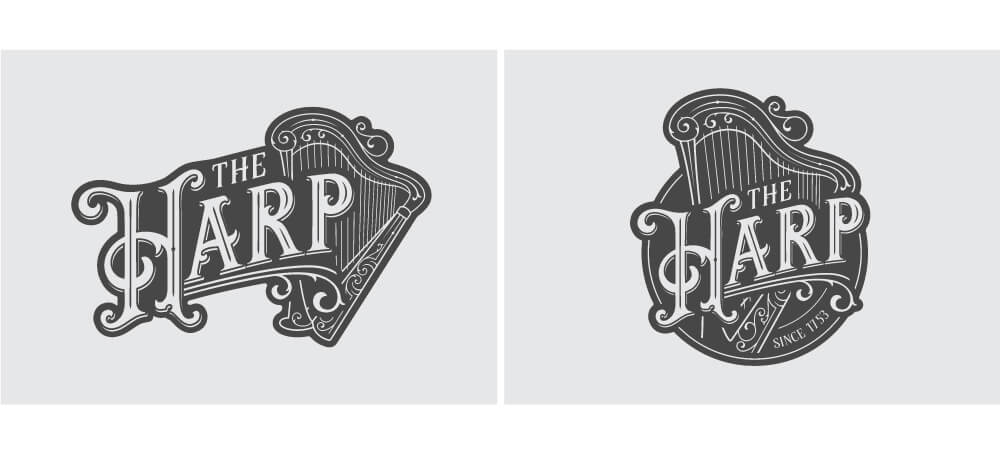
The Harp Logo Concept 1
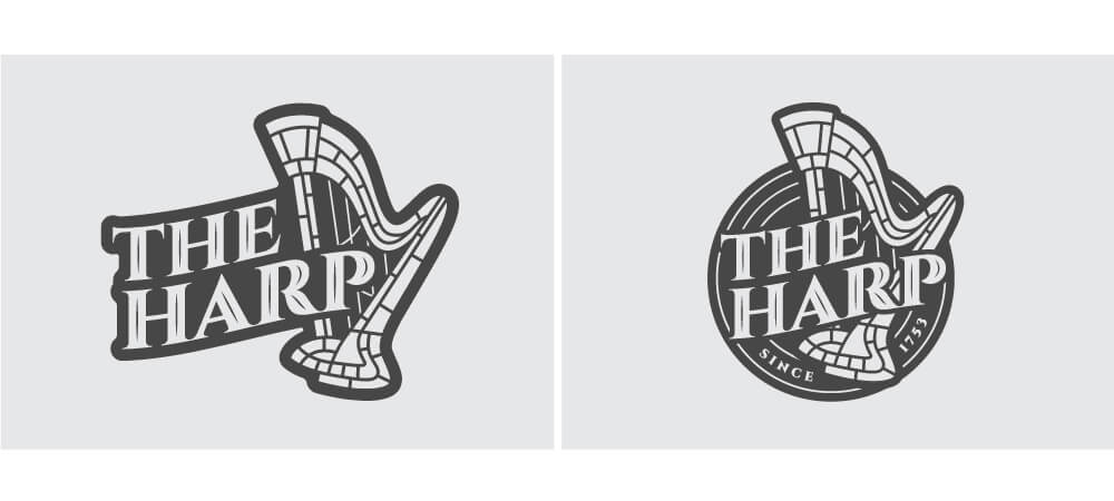
The Harp Logo Concept 2
The Harp Logo Design
The Harp Logo Design
The Harp Logo Design
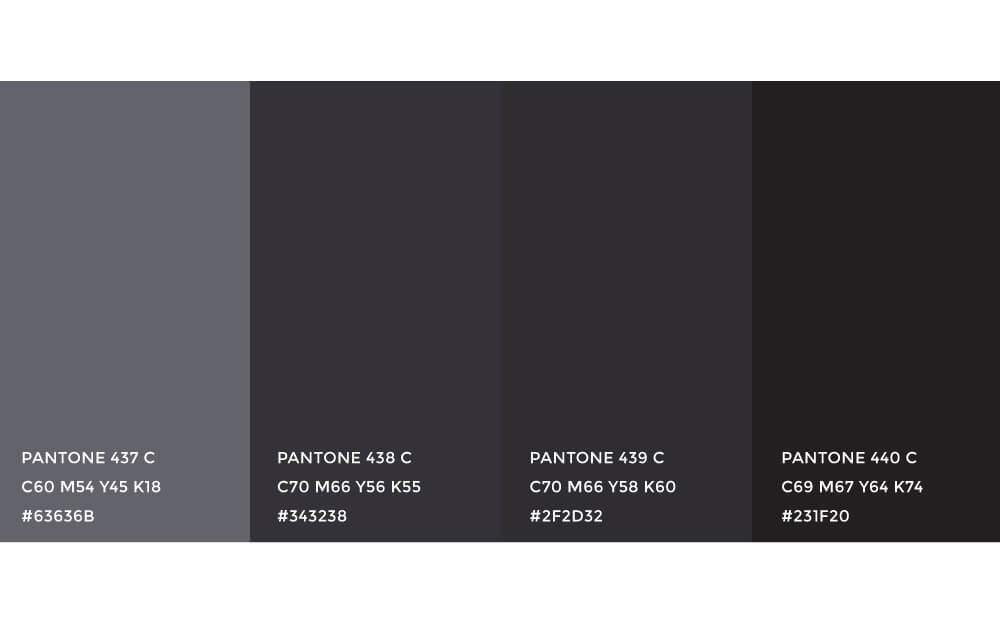
The Harp Brand Colour Pallet
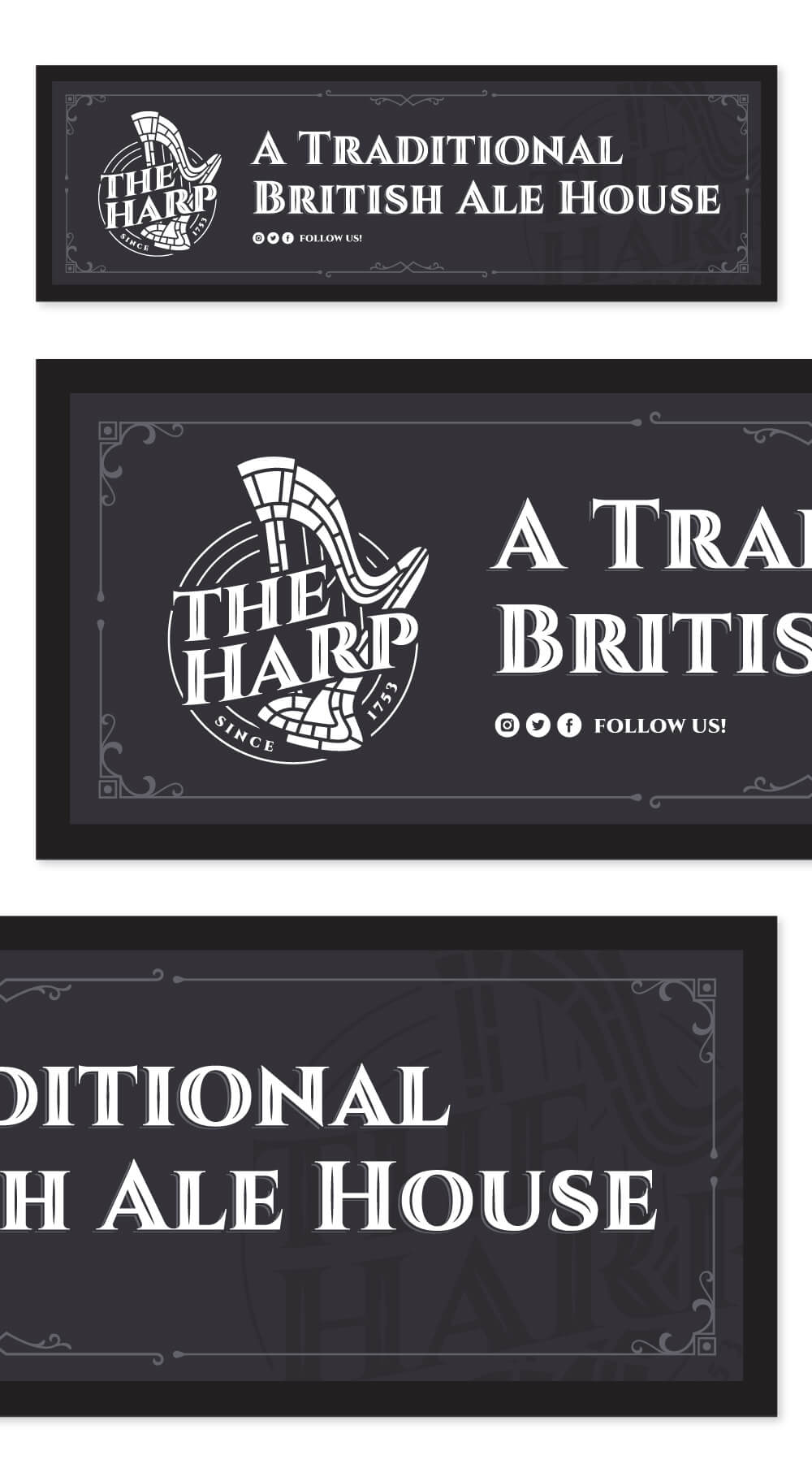
The Harp Bar Runners
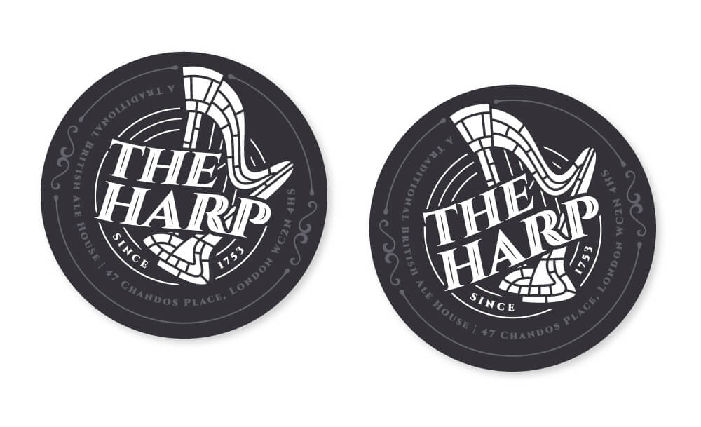
The Harp Beer Mats
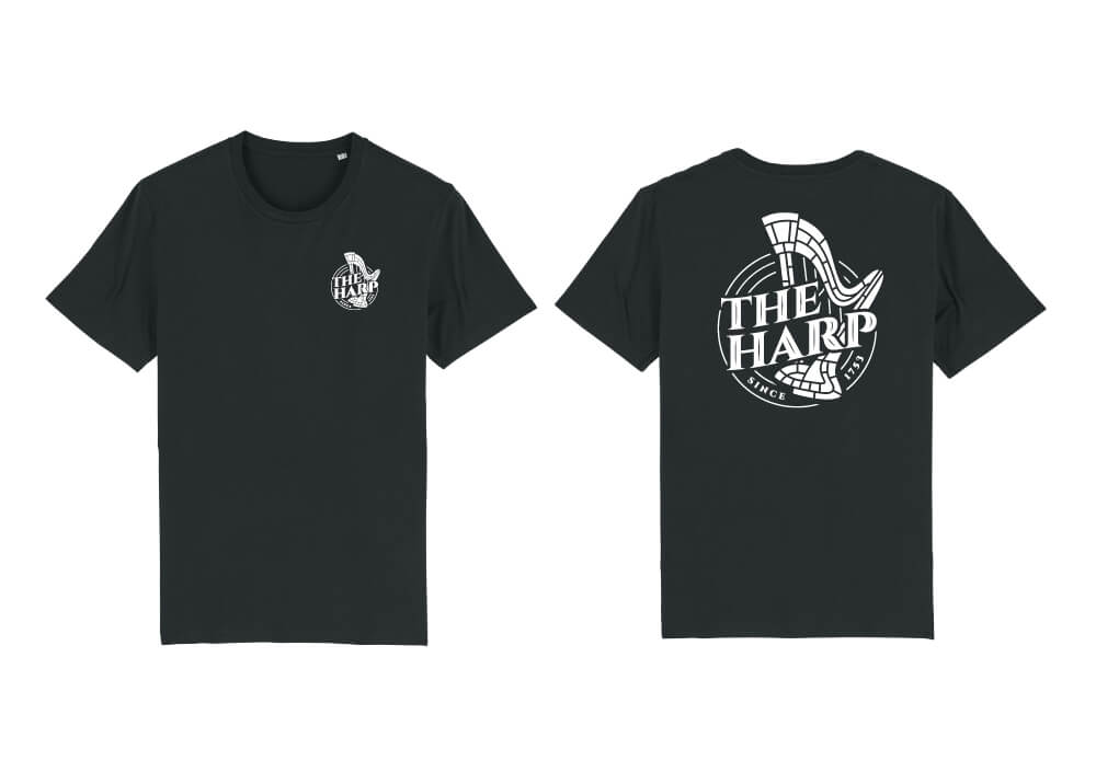
The Harp Staff T-Shirts
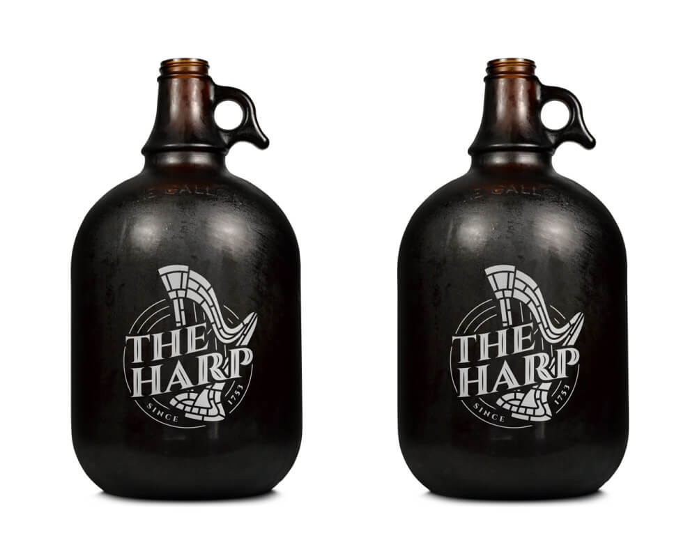
The Harp Takeaway Growlers
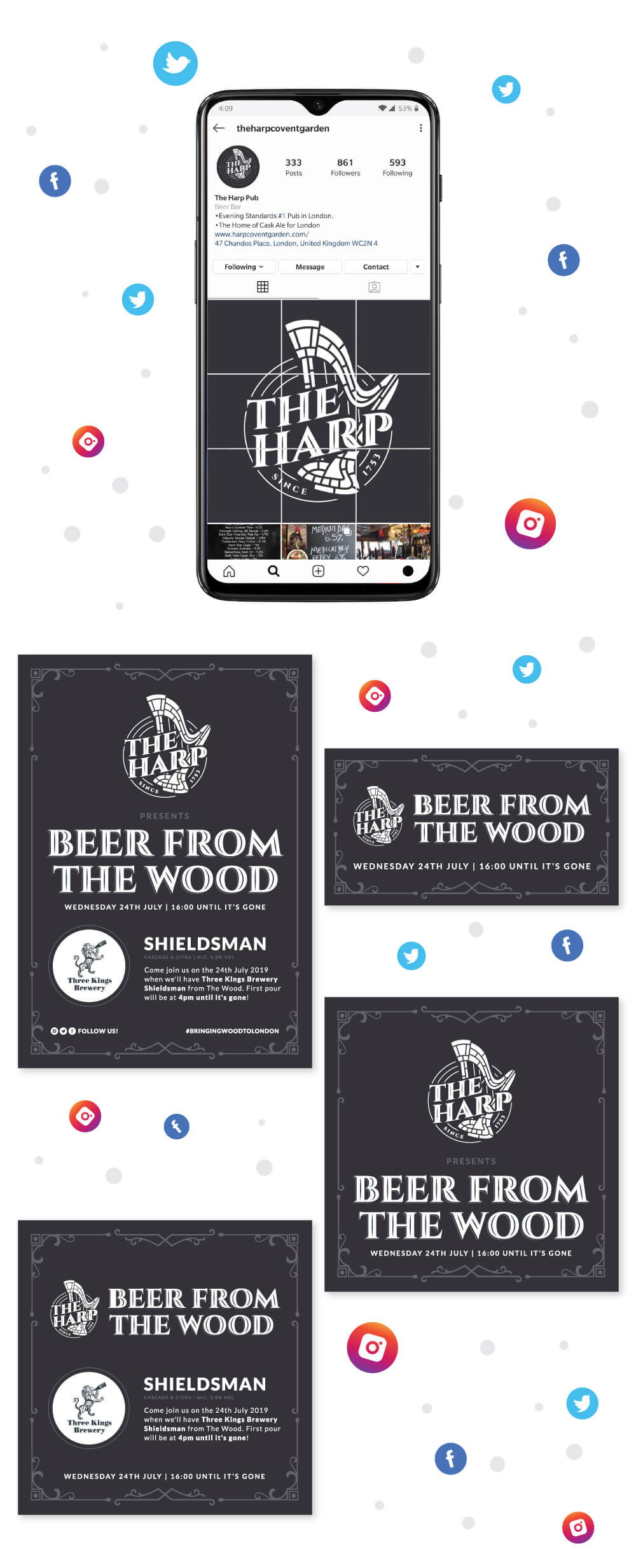
The Harp Social Media Event Creative