
RGB & CMYK - Why Some Colours Look Different in DTF
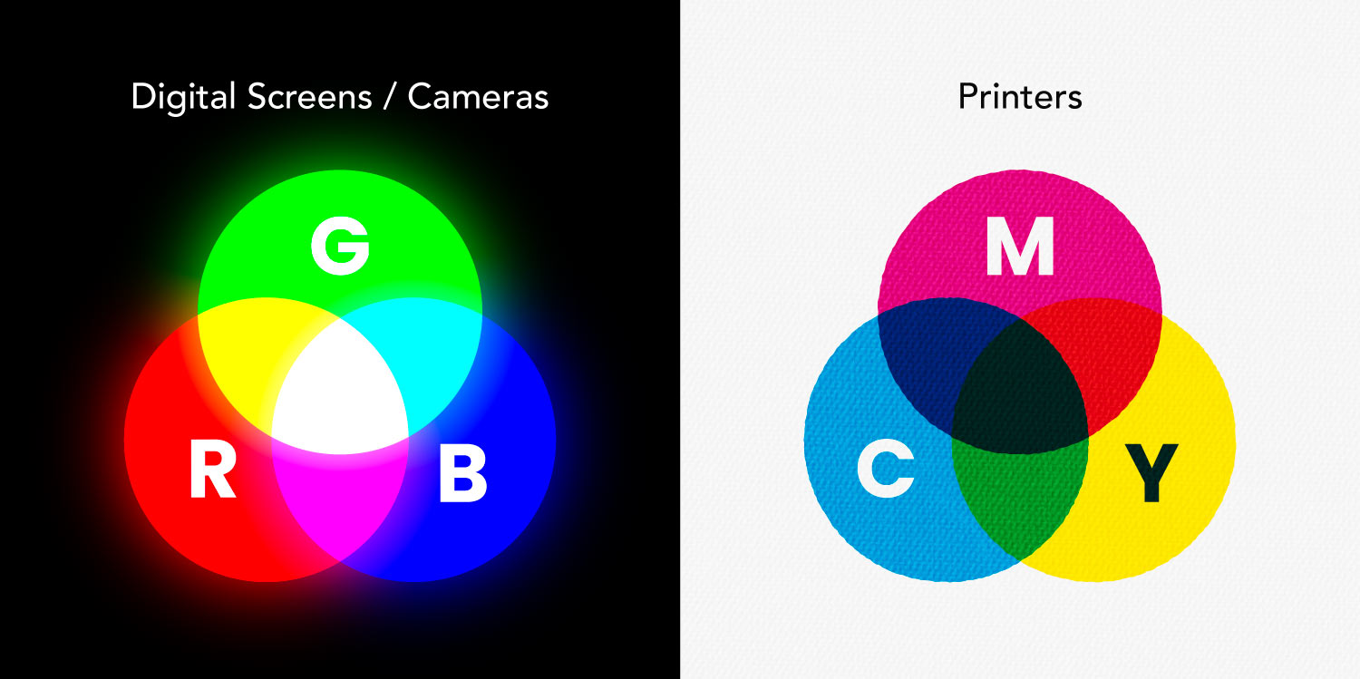
To help you get the best possible results from your DTF prints, here is a quick guide to how colour works between your screen and our printers.
Screens Use Light, Printers Use Ink (RGB vs. CMYK)
- Your screen uses RGB (Red, Green, Blue) light. Because it projects glowing light directly into your eyes, it can produce vivid shades like electric purples, neon, and lime greens.
- Our DTF printers use CMYK (Cyan, Magenta, Yellow, and Black) ink. Ink absorbs and reflects light rather than emitting it.
What does this mean for my prints?
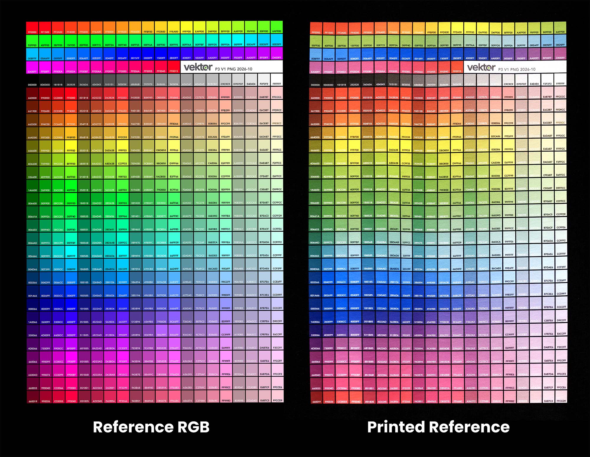
While our printers produce vibrant, retail-ready prints, CMYK inks cannot match the full glow of digital light for certain colours. When a colour on your design sits outside the printable CMYK range, the printer automatically substitutes it with the closest achievable ink shade. Note in the printed reference shown below while most colours remain vibrant, saturated purples, cyans and lime greens struggle in CMYK.
So, these vivid shades can't be achieved at all?
They can, just not with standard CMYK inks. If your artwork relies on fluorescent highlights, royal purples, or lime greens, screen printing is your answer. Unlike DTF printing, screen printing allows us to mix custom specialty inks and Pantone spot colours directly, to lay down bold, saturated pigments that CMYK simply cannot replicate. View Screen Printed Clothing.
The vast majority of everyday designs however, print with little to no noticeable difference. The colours most prone to shifting are:
- Electric purples and violets (often shift toward royal blue)
- Highlighter neons (bright greens, hot pinks)
- Cyan blues
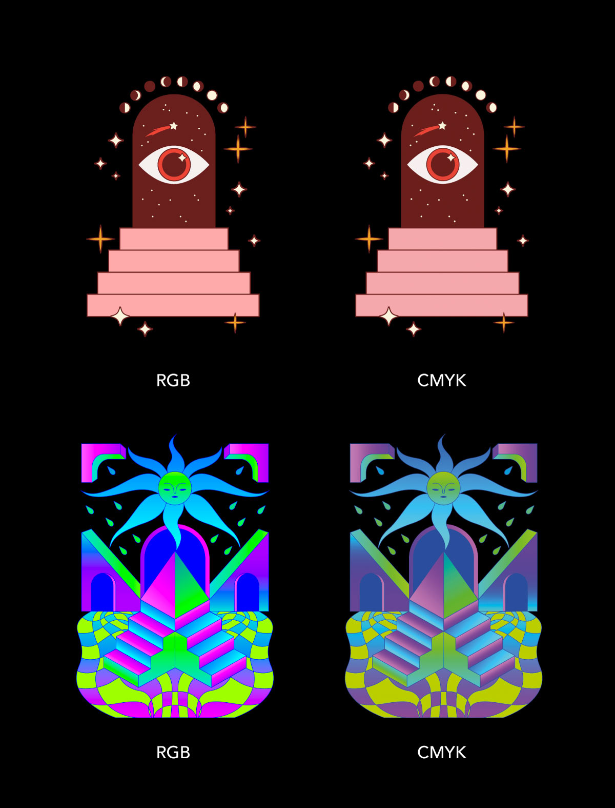
On the two designs shown below, the first sits comfortably within CMYK colour space so little colour shift is observed. The second however, heavily utilises these aforementioned colours and displays a greater shift in colour once printed.
How can I preview my print in CMYK?
If you design in professional software, you can preview how your colours will behave before ordering:
Adobe Photoshop:
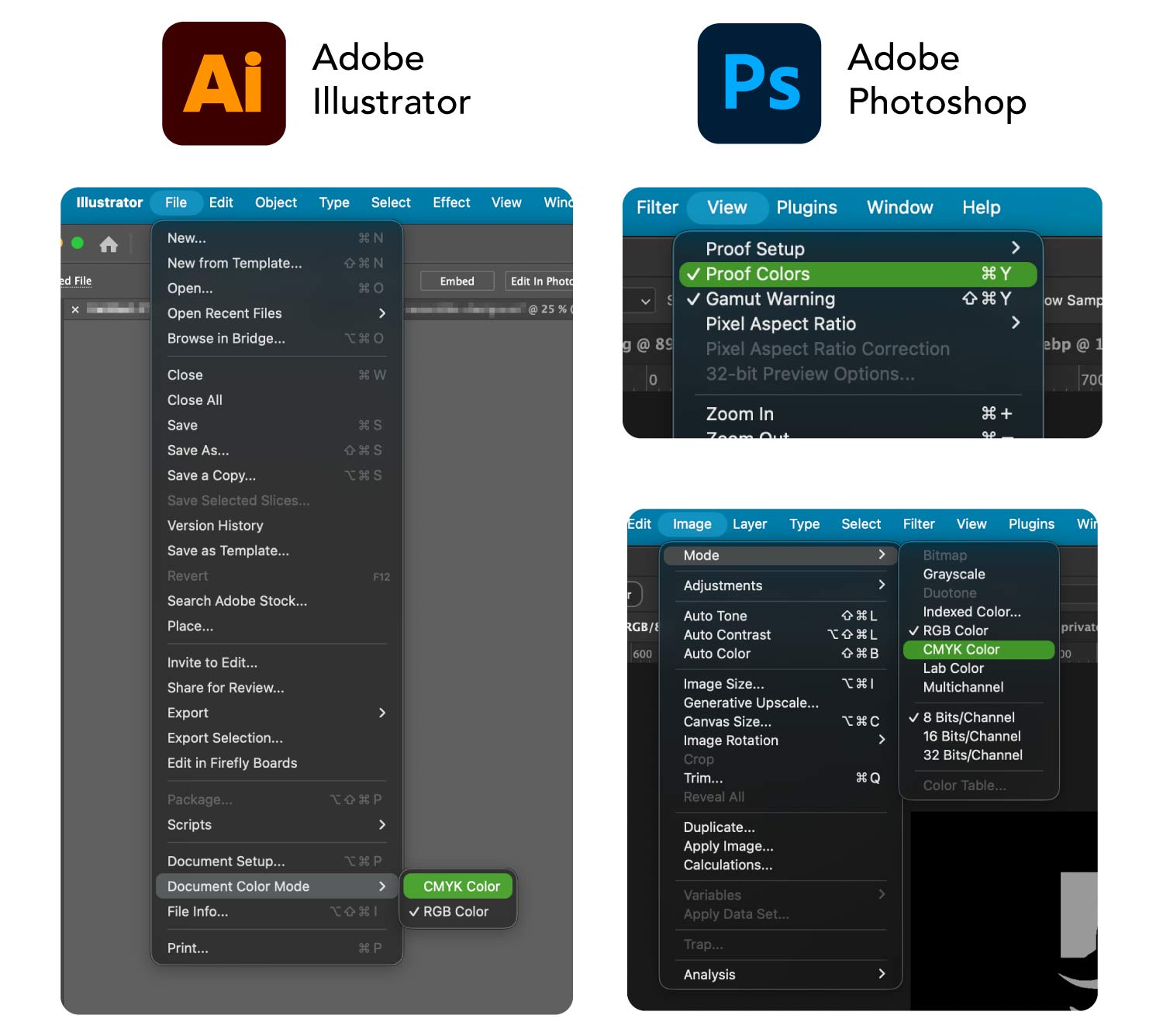
Go to View > Proof Setup > Working CMYK, then toggle View > Proof Colors (Ctrl+Y or Cmd+Y) to see an on-screen simulation of the ink conversion. Alternatively, use Image > Mode > CMYK Color, however this will strip RGB information from your design.
Adobe Illustrator:
Set your file directly to print mode via File > Document Color Mode > CMYK Color.
Canva / Other Apps:
If your software only exports in RGB, aim for slightly deeper, more natural tones rather than maximum-brightness neons.
Unsure How Your Colours Will Print?
If you have any doubts about how your artwork will translate to fabric, just let us know. Drop us a note with your design, and we’ll generate an accurate visual proof so you can review a realistic preview before anything goes to print.