Pantone Colour Matching in Screen Printing
When creating screen printed clothing in the UK, colour accuracy isn’t just a detail - it’s part of your brand identity. The right shade of red or blue can define how your audience recognises your brand across every T-shirt, hoodie or tote bag. That’s where Pantone colour matching comes in - a system that guarantees every print run delivers exact, repeatable colour, no matter the fabric, ink type or scale. At Vektor, we use Pantone matching to ensure your brand always looks the way it should.
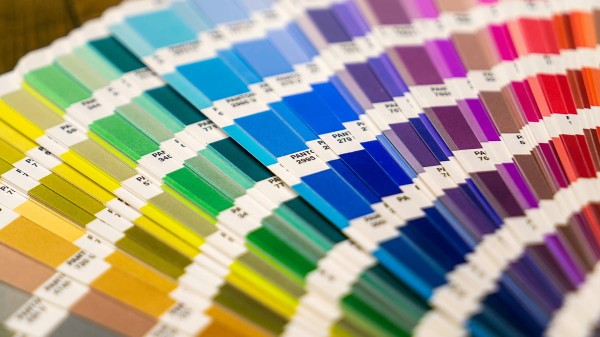
What Is Pantone Colour Matching?
The Pantone Matching System (PMS) is a universal colour standard used across printing, textiles and design. Each Pantone colour is assigned a specific code, allowing printers to mix inks to a precise formula - meaning your brand’s blue will always be your blue.
In screen printing, this process ensures that colours remain consistent between:
- Different fabric types (cotton, polycotton, blends)
- Multiple print runs
- Merch produced at different times of the year
- Pantone colour matching eliminates guesswork and gives your brand total control over its visual identity.
Pantone vs CMYK: What’s the Difference?
A lot of people confuse Pantone colour matching with CMYK printing, but they serve very different purposes in screen printing.
Pantone, often called spot colour printing, uses pre-mixed inks to create exact, repeatable shades. This means your brand’s red, blue, or yellow will look identical across every print run, fabric type, and batch - perfect for logos, brand colours, and solid designs where consistency is key.
CMYK, on the other hand, stands for Cyan, Magenta, Yellow, and Black - the four inks combined in varying amounts to produce a full range of colours. It’s great for photographic or gradient artwork, but because it blends inks rather than using pre-mixed ones, the results can vary slightly from print to print.
In short, Pantone is best for precision and brand consistency, while CMYK excels at detailed, full-colour imagery.
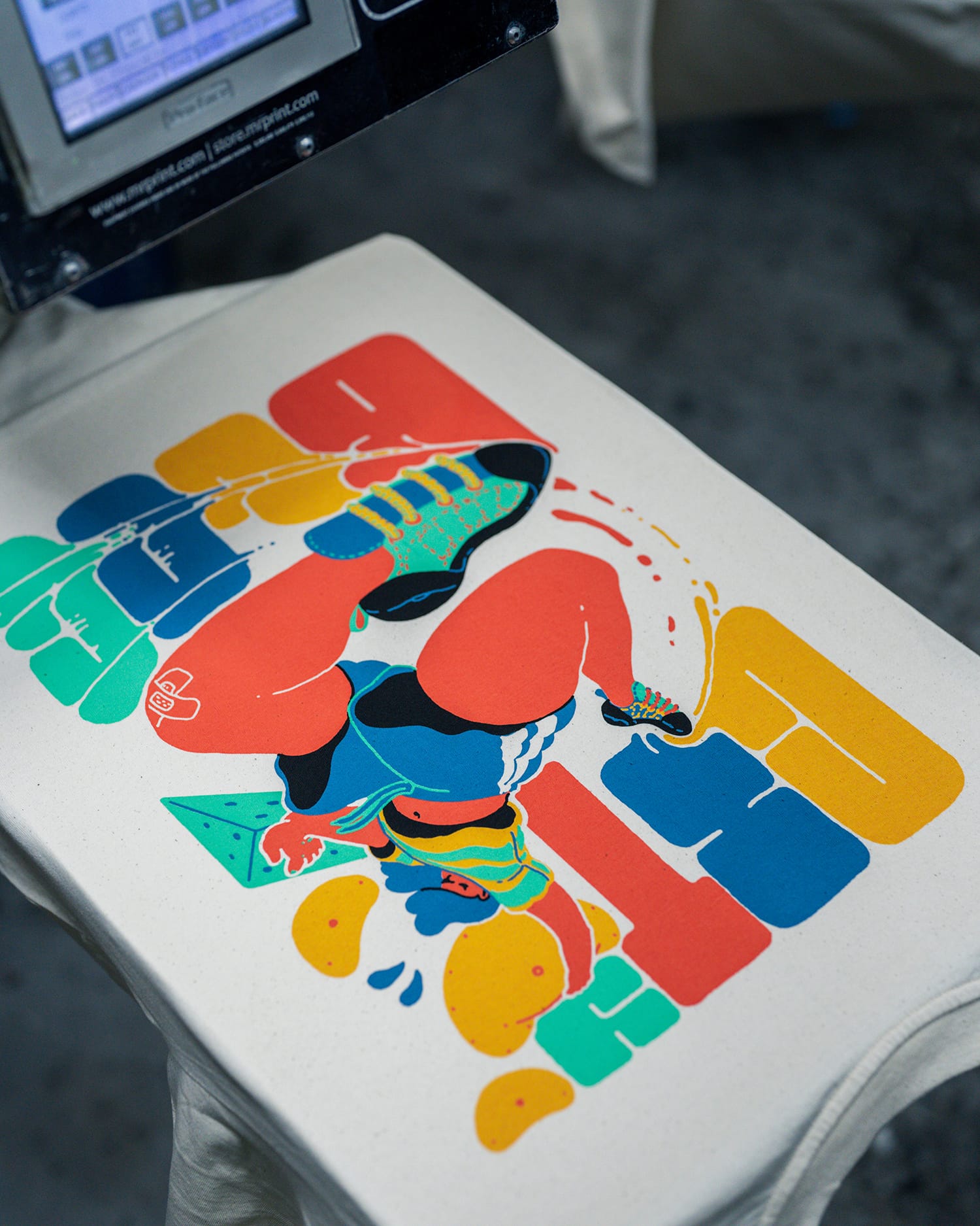
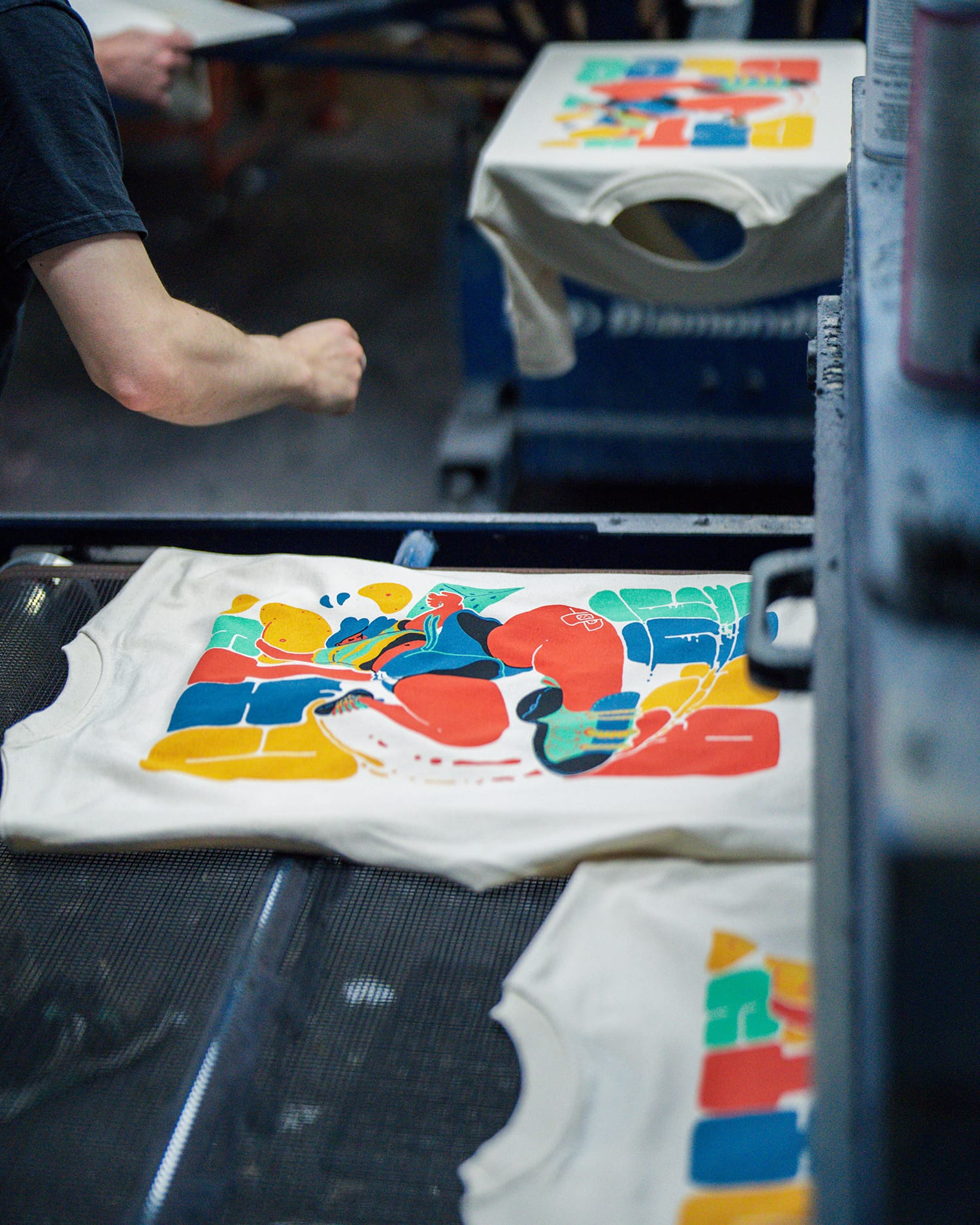
How Vektor Guarantees Perfect Colour Matching
- In-house colour mixing using Pantone-certified scales
- On-screen and print sample checks before production
- Experienced print technicians who understand fabric behaviour
- Repeatable formulas logged for future runs
This attention to detail ensures every run of your screen printed clothing in the UK looks exactly as intended - whether you order 25 pieces or 2,500.
Pantone colour matching is the backbone of consistent, high-quality screen printed clothing UK-wide. It’s how brands maintain their visual identity, project professionalism, and deliver products that their customers instantly recognise.
Ready to Print?
At Vektor, we take pride in perfecting every detail - from ink chemistry to screen tension, to make sure your colours always hit the mark.